The Component Toolbar contains links to all the features you need to use the component layout step.
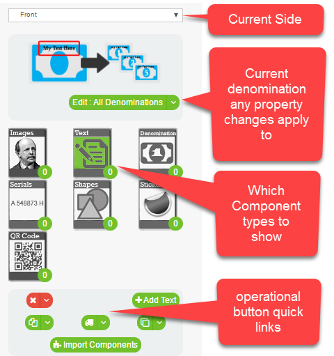
Side - You work on one side of your product at a time, use the drop down to select the current working side. The work surface will change to that sides style, and the denomination previews will update.
Current Denomination - By default when you change properties of a component they are applied to all denominations. This works for non content properties like font size, but you will probably want to give distinct content for each denomination for actual content like text and image.
Component Type - The green circle on the component type icon represents the number of components of tht type for the selected side. The current component type is highlighted green. The components for the type will show to the right.
Quick Link Buttons - Use these buttons to access all the tools for working with components.
A The Component Toolbar